New structure for the My Portfolio page
Pie chart for your securities allocation and more space for new portfolio metrics.
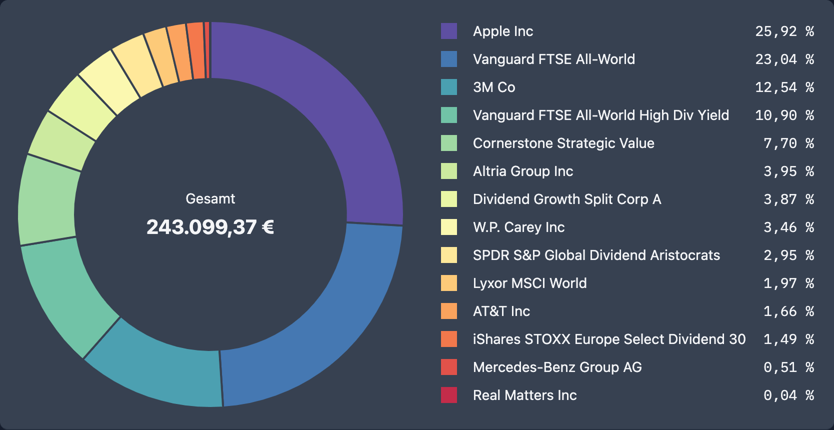
We have given the My Portfolio page a new structure to make room for the new Pie chart for your securities allocation and for more key figures that will follow in the next versions.
The My Portfolio page is now divided into 2 subpages (tabs): Depot and Dividends, between which you can switch with one click. This way the scroll path is shorter and you navigate faster to the key figures and visualizations you are interested in at that moment.
At the end of the Depot tab you will find the new Pie chart for your securities allocation (or to be more precise: Donut chart 🤓), with which you can estimate the diversification of your portfolio at a glance.

Further good dividend yields wish you
Max & Johannes