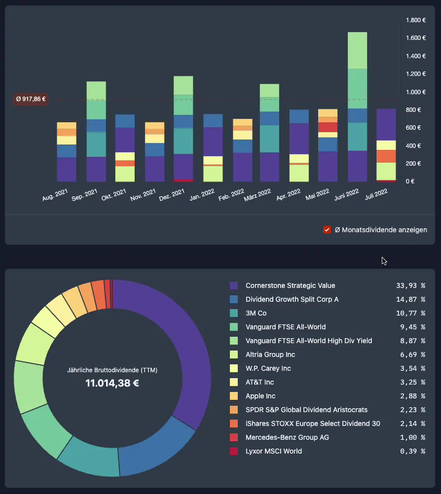
New Dividend Breakdown Charts
As an "aristocrat" you always have the distribution of your dividends in view with our new charts.
Our new dividend breakdown charts (bar chart + pie chart) give you at a glance information on how your annual dividend is composed and distributed over the year.
This way you can see if your annual dividend is well diversified across several securities or if single securities form a cluster risk for your dividend.

You can find the new charts at the bottom of the dividend tab in your portfolio.
If you are not yet an aristocrat, you can also test the new charts in our Live Demo Portfolio.
Further good dividend yields wish you
Max & Johannes