Securities allocation over time
From now on you have the possibility to show the allocation of your securities in an animation.
Does the percentage distribution of your securities at buy-in still match the distribution of your securities at the current price?
With our new animated pie chart you can see the change in the distribution of your securities over time from the buy-in price to the current price and easily decide if your current allocation still matches your original strategy.
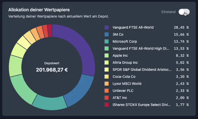
You can find the animated chart at the end of the portfolio tab in your portfolio.
If you are not a DivvyDiary user yet, you can also test the new chart in our Live Demo Portfolio.
Further good dividend yields wish you
Max & Johannes