Historical dividend yield & share price performance
New line charts showing the development of dividend yield and price per security.
On our securities details page (e.g. for Microsoft) we have added two new functions as of today:
1. Historical dividend yield
The new line chart provides information on how the dividend yield for the selected security has developed over time.
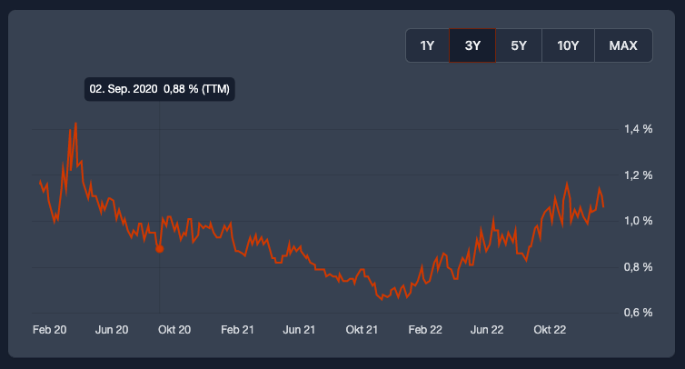
It is used by some dividend lovers as an indicator to evaluate if the security is undervalued from a dividend yield perspective today.
If the current dividend yield of a very good company with a reliable dividend history is above the average of the last years, it can be a good time to buy. Of course, other key figures should be checked before making a purchase.
This feature is exclusively available to our Aristocrat members, whose support enables the active development of DivvyDiary.
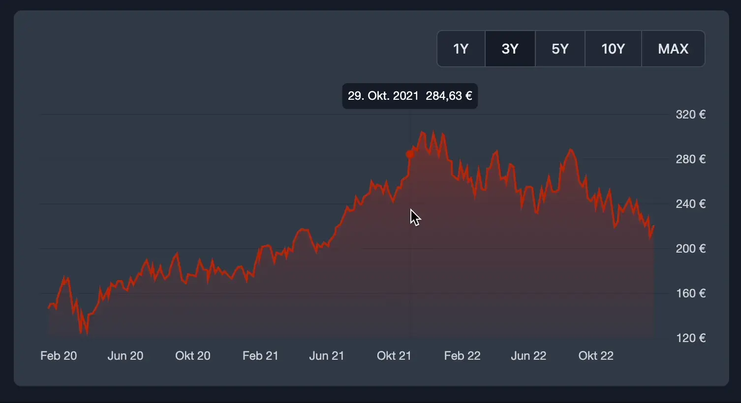
2. Historical Stock Price
As most of you are used to from many other apps, we now also show the historical stock price per security as a line chart.
As a small special feature you have the possibility to view the percentage change of the price over a freely defined period of time.
We hope you like the new functions.
Further good dividend yields wish you
Max & Johannes