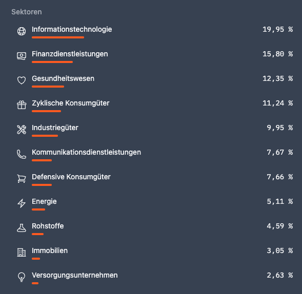
Evaluation by sectors
New pie charts: View your portfolio and dividend income by sector.
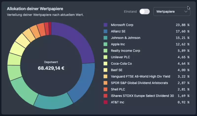
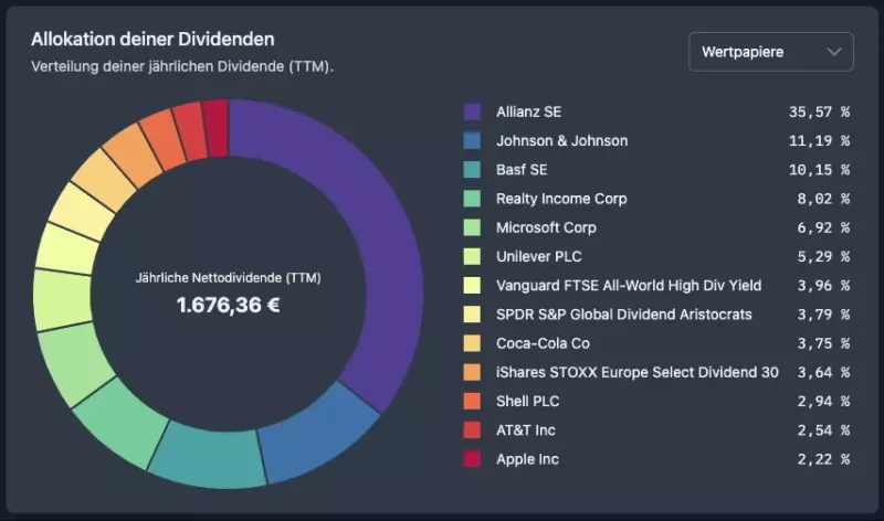
We have built two new charts that allow you to see how diversified your portfolio and dividend income are by sector.
Just go to your portfolio and select Sectors from the dropdown menu to the right of the Allocation of your securities chart.
As an aristocrat, you also have the option in the Dividends tab of your portfolio to change the Allocation of your dividends chart to Sectors as well.
Additionally we have integrated the sector information in different places in DivvyDiary:
- New filter option in our stock screener (All securities) including its own table column, so you can discover targeted dividend stocks from a specific sector.
- New optional table column in the securities list in your portfolio, so that you can see the sector for all your securities at a glance.
- Display of the sector on the dividend history page of each company, e.g. Apple. For ETFs and funds, the percentage distribution is broken down by sector, e.g. Vanguard FTSE All-World UCITS ETF (USD) Distributing.
If you are not yet an aristocrat, you can also check out the new chart for distributing your dividend income by sector in our Live Demo Portfolio.
Further good dividend yields wish you
Max & Johannes